
FPP Alphabet Patterns
More than you wanted or cared to know

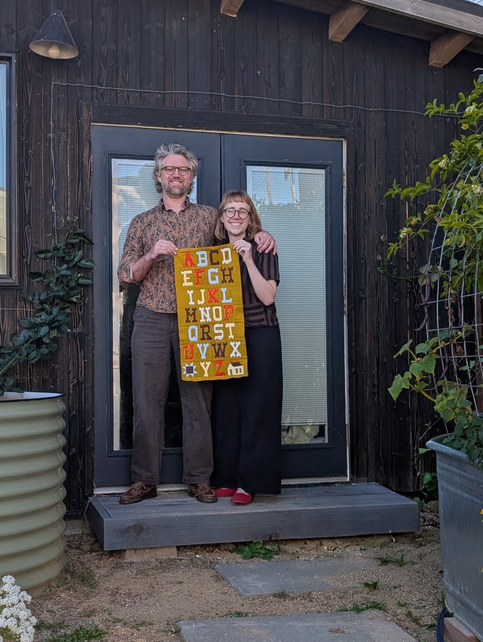
Quilt lettering is a strong special interest of mine, and I’ve been working on some foundation paper piecing alphabet patterns over the last 6 months. For this project, I recruited my wonderful, clever, and patient Rubik's Cube-minded spouse. He also went to school for product design and works in the construction design industry and uses a bunch of design software geared towards architects and uniquely perfect for FPP letter applications. We also just really enjoy doing all kinds of projects together (like the backhouse I sew in, pictured behind us in the photo) and working in tandem on the couch while the most vile reality TV is playing in the background after our children are asleep.
One font was quite a simple brief: let’s make a Spaghetti Western-style FPP font. Obvious for a sewing business called Spaghetti Western Sewing, no?
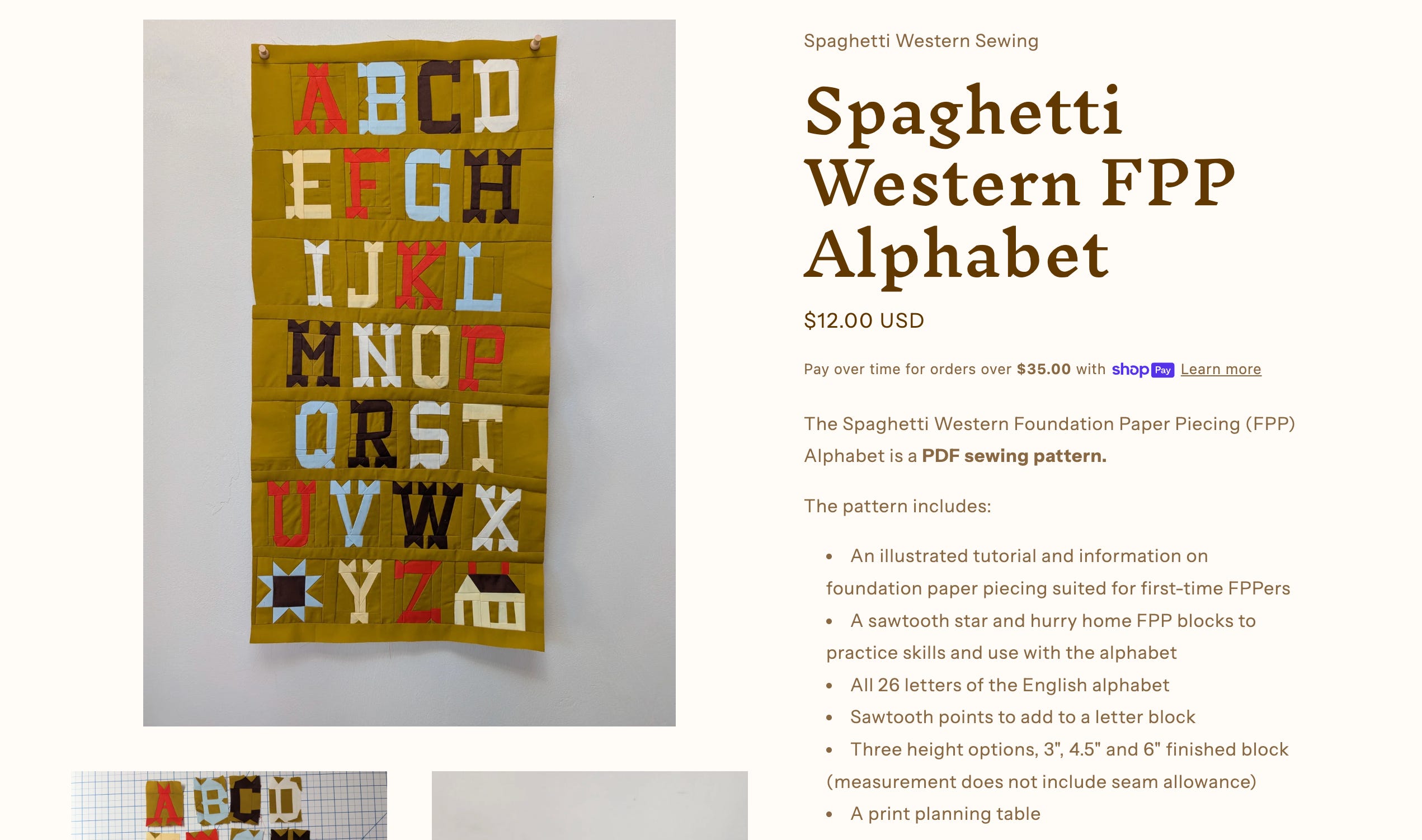
Working on this was silly and surprising at every turn. I think you’d be delighted to discover how often Western fonts are used casually in our everyday environment once you start looking for them. This could be a California-specific phenomenon, but I doubt it. I was also surprised at all the different flavors of Western text floating around out there in the world. After months (maybe close to a year?) of playing an ongoing game of Eye Spy Western Font, we decided to go for a real Ghost Town, cartoon evil villain with this one. I (biasedly) think the final alphabet delivers on vibes, and I can’t wait to see what people make with it!
While working on the Western font, another idea popped into my head, and I couldn’t resist tackling both ideas simultaneously. Protest art and the importance of text in art have been at the top of my mind for many years and more intensely in the last couple of months due to *gestures at the state of the US’s fuck-ass government*. I loved reading Design Behind “I AM A MAN” Protest Poster and Text is King here on Substack. I also stumbled across Comrade Sisters: Women of the Black Panther Party at my local library on one of those dreamy, unhurried maternity leave mornings and took it home with me to pore over.
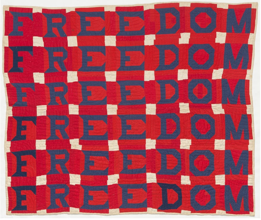
I was also strongly moved and inspired by the Freedom Quilt and the graphic design/iconography of civil rights movements in the Bay Area. I am a proud native of the San Francisco Bay Area, and if you’ve had the pleasure to live here, you know how steeped in justice and protest culture we are. The more I thought about the roots of this visual inspiration, the more sources popped into my head. Here are a few sources I dove into to get you started.


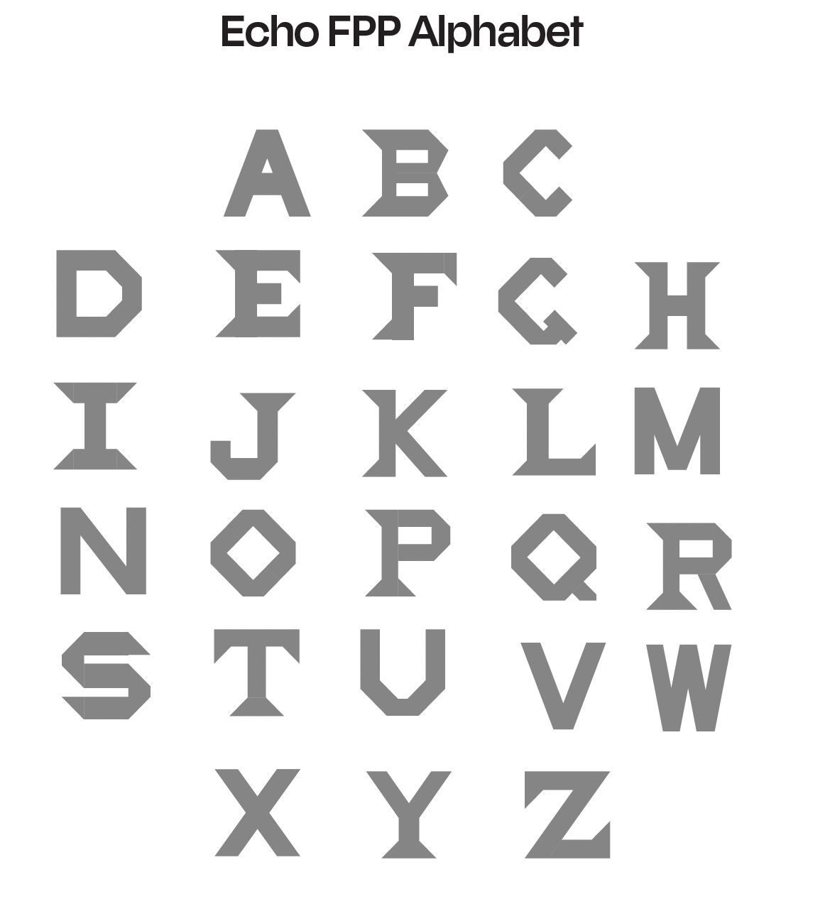
All of these have been in my realm of awareness to some degree, but I took this opportunity to get quite geeky about it. I really enjoyed having these as the foundation of my work while coaxing my spouse to make infinite silly, itty-bitty 1/16-inch adjustments to my Echo letters (he was a great sport and extremely accommodating). It helped remind me that art and design aren’t by accident; they are a conversation. When you listen closely to those before you and around you, your own work is informed and hopefully contributes to the conversation rather than awkwardly parroting it. You might not see the influence of these people and movements blatantly in the Echo FPP letters, but they all helped shape them as they tumbled out of my brain and into existence. At the very least, it kept my momentum going to push through two FPP alphabet patterns simultaneously.
The name “Echo” references these inspirations and how resistance vibrates through generations and timelines. This concept has been heavy on my mind and has shown up in so many ways. During my recent and last maternity leave, I read the Suzanne Collins Hunger Games prequels, Sunrise on the Reaping and The Ballad of Songbirds and Snakes, and then proceeded to read the original trilogy. I feel a bit sheepish admitting what a big influence these YA books have on me, but I really enjoy Suzanne Collins' writing! I was happy to find that re-reading the Hunger Games series at a different point in my life was just as enjoyable and thought-provoking as it was the first time in my teens. I found the new prequels especially added layers of nuance and complexity to the world, themes, and characters. The movies don’t even begin to do the heft of the storyline justice. Maybe it’s part of ageing, but shifting into a phase in my life where I am the steward of the next generation feels like looking into an infinity mirror and realizing that at my back there are hundreds of people and stories I will never know, but touch me, and at my front extends the same, just in the future. I’m also old enough now to look back on my younger, fiery self with tenderness and confidently know that the urgency and nowness I felt then is a gift of the age that matures with time. I look at folks older than me now and know that they were once teenagers, slowly molded by chance and choices just like me. After stewing in these thoughts while rocking my baby to sleep, doing laundry, grocery shopping, changing diapers, pumping, tidying, wiping, sweeping, and a little bit of weeping, I have a new lens to experience information with. I watched the Freedom Riders Documentary on PBS shortly after gaining this new lens and felt so grateful and in awe of how much was risked for our generation to be facing the fights we are instead of the codified segregation of the 1960s.
A final disclaimer
It is kind of ridiculous to design an FPP pattern based on traditional alphabet piecing blocks, I know! The letter identity exists precisely because of the limitations of patchwork, but hear me out! FPP allows the maker a higher level of precision and, therefore, control over each letter’s design details. I was able to make lots of small tweaks, which impact the overall feeling of the alphabet in a way that is challenging to do with patchwork. The accuracy of an FPP letter will always be much higher than a patchwork letter, no matter how skilled a sewist you are, so it also guarantees continuity in letter outcome. I do think part of the charm of patchwork lettering is the inconsistency of it, but FPP can be a less frustrating option for newer sewists and/or someone embarking on a large project.
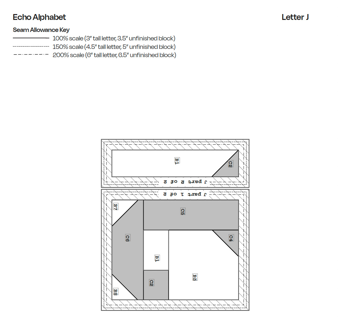
FPP also allows you to use abstract fabric scraps and skip the tedious process of cutting and managing hundreds, perhaps even thousands, of small and precise quadrilateral shapes. FPP provides a lot more sizing flexibility as well, since you can go much smaller than patchwork and easily print the letter templates scaled up or down to change the size without having to recalculate anything. We even designed a seam allowance indication so that you have a 1/4” seam allowance guide when you print at 100%, 150%, and 200%, which was my brilliant spouse’s idea and, to my knowledge, the first FPP alphabet with this feature. Without the guides, you’d have to redraw a 1/4” seam allowance onto each section if printing at anything other than 100% scale.
The Spaghetti Western Alphabet pattern was released yesterday and is on sale until Friday, 5/22. Echo is mid-test sew and may have a couple of style edits left, but I expect it to be ready within a month max. I hope you found some part of the behind-the-scenes share interesting. Let me know if I didn’t cover something you’d like to know! I simply enjoy the process of FPP and hope these patterns encourage folks to create some beautiful and strongly worded quilt art to echo throughout your own ecosystems and generations.
Wowsers!!!!
Loved reading the process on these letters :) I have also been very into quilted lettering recently, and was ALSO first drawn in to that journey by the Freedom Quilt. I have been so inspired by all the protest quilts lately and appreciated your compilation of some protest imagery. This must be my sign to learn FPP!